In the past decade, data has become a core part of business systems. Every click, transaction, sensor readout, and customer interaction adds to a growing digital record. But having lots of data does not automatically lead to better understanding or smarter decisions. Surveys have shown that many organizations struggle to use even their own data. For example, one study found that most analytics teams spend more time preparing and cleaning data than actually analyzing it, slowing down decision cycles and limiting impact. Gartner also reports that poor data practices can cost organizations millions annually in inefficient decisions and wasted efforts.
Even when data is technically clean, traditional analytics tools — dashboards, visualizations, routine reports — often fail to help people understand complicated patterns, especially when multiple dimensions (like time, geography, category, and customer behavior) interact. The result is that analysts generate charts, but decision makers still ask: So, what really happened? The MDSF: Context-Aware Multi-Dimensional Data Storytelling Framework paper aims to bridge that gap. It proposes a way to automatically generate stories from data that actually make sense to humans and keep the context of what matters.
Why Simple Analytics Tools Don’t Always Help
Take a common scenario: a sales team reviews a dashboard with charts showing monthly sales, regional differences, and product performance. Everything looks like numbers on a page. But when someone asks why sales dropped last month in one region, the dashboard offers little help. It can show the drop, but not explain it.
This limitation isn’t just a local problem. IBM estimated that about 90% of the data generated by organizations goes unused in analytics — often because teams lack tools to find patterns and explain them. In other words, a lot of data sits idle because understanding it is too hard.
Dashboards and reports can show what happened. But they rarely explain why things happened. They don’t link one trend to another. They don’t adapt the explanation to what the viewer already knows. And they don’t focus on what’s most important to a specific decision. The result: people look at charts but still make gut decisions because the tools didn’t fill in the reasoning.
What MDSF Does Differently
The MDSF paper proposes a structured approach to solving this problem. Instead of only showing charts, it builds a pipeline that discovers insights from data and then generates readable explanations that connect those insights.
The core idea is to combine traditional analytics techniques with a large language model (LLM) that generates text, guided by the patterns found in the data.
Here’s how the process works:
1. Preparing the Data:
The system first slices and prepares multidimensional data — like breaking it down by region, customer type, time, and product category. This makes it easier to spot patterns in complex datasets.
2. Finding Important Patterns:
Instead of just listing all trends, the framework identifies insights — patterns that are meaningful, unusual, or potentially useful. It uses statistical measures and logic to decide what counts as an insight.
3. Scoring and Ranking Insights:
Not all insights matter equally. MDSF ranks them using several dimensions, including an Importance score that measures how much a piece of information matters for the overall dataset. In the original paper, the authors define Importance with the following formula:
A simple way to read this:
- is the difference between a subspace value and the average, so it captures how much that subspace stands out.
- is the total of all values, normalizing the score so that it isn’t just about scale.
- is a multiplicative factor that the authors use to adjust the importance based on where the subspace lies in the distribution (so bigger, frequently observed subspaces can get more weight).
This formula honours both the magnitude of a deviation and its position in the dataset, which is value-driven and practical for scoring insights in real world business tables.
4. Generating the Story:
Finally, the framework uses an LLM to turn the top ranked insights into a narrative — a flow of text that explains what happened and why it matters. This narrative is intended to read like a human wrote it, not like a generated report that simply dumps numbers.
The paper also describes a process that keeps the story consistent as it grows, ensuring it doesn’t veer off track or repeat information unnecessarily.
Where MDSF Makes Real Progress
MDSF has several strong contributions that are worth noting:
1. Prioritizing the Right Information
One of the biggest frustrations with analytics tools is that they overwhelm users with too much data. MDSF’s scoring system filters out noise and focuses on what matters. This approach aligns with wider industry trends in augmented analytics, where AI helps humans focus on insights rather than data preparation alone.
2. Text That Connects the Dots
Most analytics tools end at visualizations. MDSF goes a step further by generating narratives that connect patterns and provide context. Instead of saying “sales dropped in Region A,” it can explain why that drop matters and what patterns support that explanation.
3. Reducing Misinterpretation
Because the narratives are tied to ranked insights, the system avoids some of the problems seen in generic text generation, like incorrect or misleading claims. The output isn’t free text; it’s constrained by the patterns the system identified as meaningful.
In many ways, MDSF moves analytics tools closer to how human analysts think — finding patterns, assessing their importance, and explaining those to decision makers in plain language.
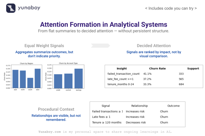
While Context Exists, It Is Procedural — Not Structural
A key part of the MDSF framework is context. The system is aware of what it has already explained and what matters in a particular narrative session. It uses this information to avoid repeating insights or focusing on irrelevant details. But this form of context is procedural — it exists only within the current analysis session.
What it doesn’t do is build a structured, persistent representation of knowledge — a map of how data elements, insights, and domain meanings relate to each other over time. The system can remember context in the moment, but that memory doesn’t exist as a long-lasting structure that can be referenced later.
This distinction matters because long-term structural context — like how different metrics influence each other, how business processes link to outcomes, or how events in one dataset relate to another — can make future analyses faster, more accurate, and more explainable.
Why Structural Context Matters
Consider two scenarios:
1. Supply Chain Analysis
In supply chain operations, thousands of variables — delivery times, equipment performance, weather data, and inventory levels — interact. Analysts often use causal models to understand which factors influence delivery delays. These relationships are structural: they exist independently of any one narrative session. Tools that only capture context procedurally might explain a single incident but won’t build long-term knowledge that streamlines future explanations.
2. Customer Behavior Tracking
Similarly, in customer analytics, patterns like “late payments often precede churn” are structural relationships. If a tool only considers what is in view for one session, it won’t carry that relationship forward to future analyses automatically.
In many businesses, structured context — relationships, constraints, causal links — lives in training manuals, organizational knowledge guides, or domain frameworks. These are not easy to encode in automated systems, but their absence is often felt in repeated analysis cycles.
Looking Ahead: Stories That Remember
The MDSF framework makes an important step forward: it builds a process that discovers patterns in multidimensional data and tells coherent stories about what those patterns mean. This approach helps teams move beyond dashboards and charts toward explanations that help people make better decisions.
But as analytics needs grow more complex, tools will need to combine moment-to-moment context (as MDSF does) with persistent structural knowledge that captures relationships and makes future analysis easier and more accurate.
The journey from raw data to real understanding is still underway. MDSF shows us the path — and highlights where the next advances need to be.
Walking Through the System in Code
The goal is not to build a predictive model, but to show how analytics behavior changes when insights are discovered, ranked, and narrated as a system rather than surfaced as isolated charts.
1. Creating the Customer Context (Static Dimensions)
Establish customer-level context that remains stable over time and is typically used only as filters in dashboards.
import numpy as np
import pandas as pd

np.random.seed(42)

num_customers = 600
customer_ids = np.arange(1, num_customers + 1)

customers_df = pd.DataFrame({
    "customer_id": customer_ids,
    "age": np.random.randint(21, 70, size=num_customers),
    "job": np.random.choice(
        ["admin", "technician", "services", "management", "retired", "student", "blue-collar"],
        size=num_customers,
        p=[0.15, 0.18, 0.20, 0.15, 0.12, 0.08, 0.12]
    ),
    "marital_status": np.random.choice(
        ["single", "married", "divorced"],
        size=num_customers,
        p=[0.35, 0.50, 0.15]
    ),
    "education_level": np.random.choice(
        ["secondary", "tertiary", "primary"],
        size=num_customers,
        p=[0.55, 0.30, 0.15]
    ),
    "region": np.random.choice(["north", "south", "east", "west"], size=num_customers),
    "account_type": np.random.choice(
        ["savings", "current", "credit"],
        size=num_customers,
        p=[0.55, 0.30, 0.15]
    ),
    "tenure_months": np.random.randint(3, 180, size=num_customers)
})

customers_df["avg_balance"] = (
    customers_df["tenure_months"] * np.random.uniform(8, 15, size=num_customers)
    + np.random.normal(0, 500, size=num_customers)
).clip(lower=0).round(2)

customers_df
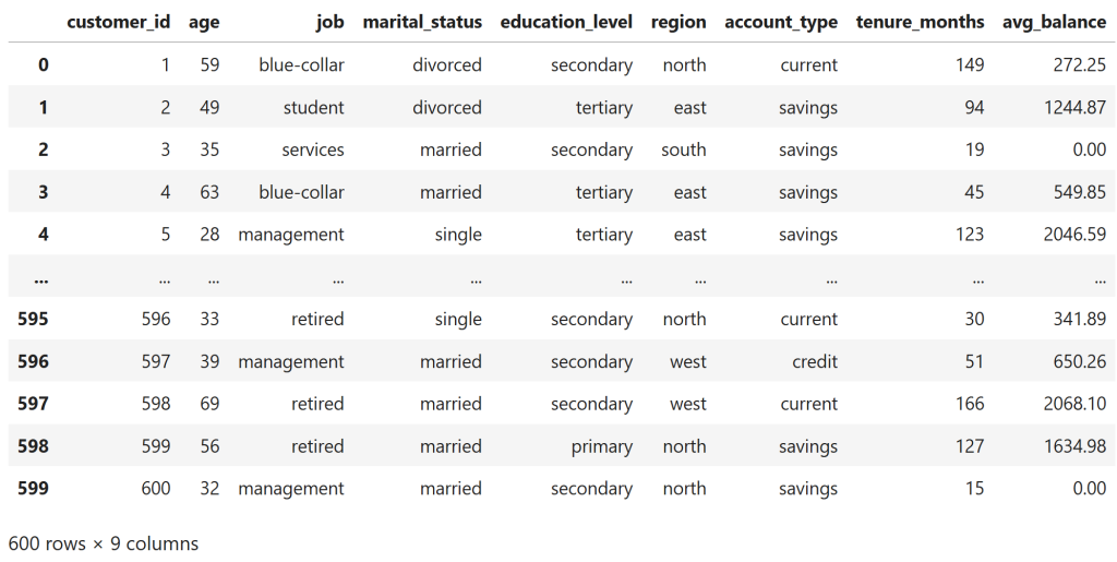
Even in the raw customer profile, there is visible structure rather than pure randomness.
Customers with very short tenure often appear with low or zero average balances, while customers with longer tenure tend to show higher balances, albeit with noise.
This is intentional — the dataset embeds weak but realistic relationships so that meaningful patterns exist before any analytics or modeling is applied.
2. Introducing Time Through Transaction Behavior
Add a time dimension so that patterns can evolve rather than remain static snapshots.
months = pd.date_range("2024-01-01", periods=12, freq="MS").strftime("%Y-%m")
transaction_records = []

for _, row in customers_df.iterrows():
    base_txn = (
        np.random.randint(5, 15) if row["account_type"] == "savings"
        else np.random.randint(15, 30) if row["account_type"] == "current"
        else np.random.randint(10, 25)
    )

    for month in months:
        txn_count = max(0, int(np.random.normal(base_txn, 3)))
        total_amt = max(
            0,
            np.random.normal(row["avg_balance"] * 0.3, row["avg_balance"] * 0.2 + 100)
        )

        failed_txn = np.random.binomial(1, 0.25) if row["avg_balance"] < 300 else 0

        transaction_records.append({
            "customer_id": row["customer_id"],
            "month": month,
            "transaction_count": txn_count,
            "total_transaction_amount": round(total_amt, 2),
            "avg_transaction_amount": round(total_amt / txn_count, 2) if txn_count > 0 else 0,
            "failed_transaction_count": failed_txn
        })

transactions_df = pd.DataFrame(transaction_records)
transactions_df
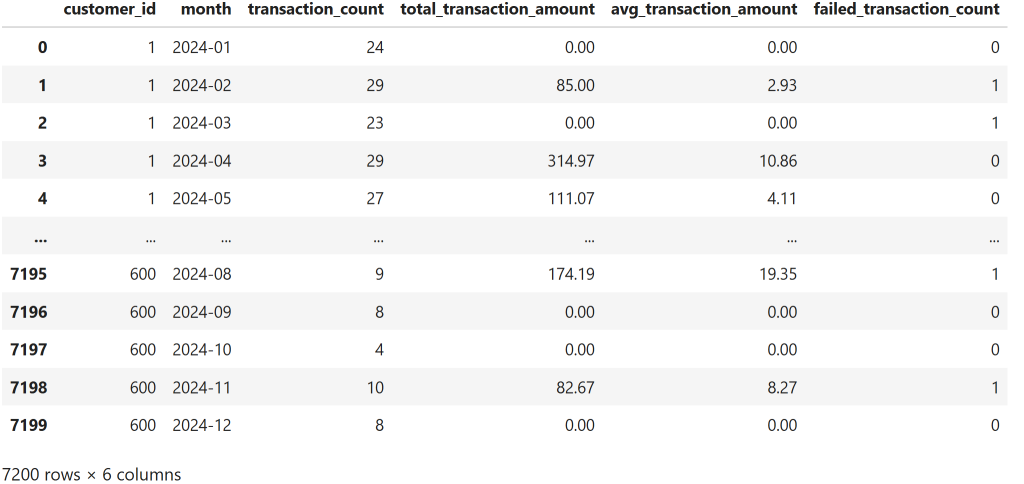
Each customer now appears repeatedly across monthly records, with transaction counts and amounts varying from month to month rather than remaining fixed.
Failed transactions occur intermittently within these sequences, introducing irregular events into otherwise routine behavior.
This temporal structure makes it possible to reason about evolving patterns and sequences, rather than relying on single-point summaries.
3. Adding Penalty Signals (High-Impact Events)
Introduce sparse but high-impact signals that often matter more than averages.
penalty_records = []

for _, txn in transactions_df.iterrows():
    balance = customers_df.loc[
        customers_df["customer_id"] == txn["customer_id"], "avg_balance"
    ].values[0]

    late_fee = np.random.binomial(1, 0.35) if txn["failed_transaction_count"] > 0 or balance < 400 else 0
    overdraft = np.random.binomial(1, 0.20) if balance < 200 else 0

    penalty_records.append({
        "customer_id": txn["customer_id"],
        "month": txn["month"],
        "late_fee_count": late_fee,
        "late_fee_amount": late_fee * np.random.choice([25, 50, 75]),
        "overdraft_count": overdraft,
        "overdraft_amount": overdraft * np.random.choice([35, 70, 105])
    })

penalties_df = pd.DataFrame(penalty_records)
penalties_df
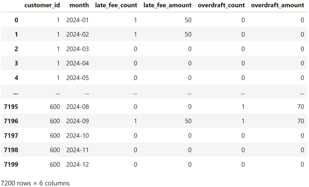
The penalties data is intentionally sparse: most customer–month records show no late fees or overdrafts, while penalties appear only in isolated months.
When they do occur, they show up as discrete events rather than gradual trends, embedded within otherwise normal transaction histories.
This combination of sparsity and intermittency makes penalty signals easy to overlook in aggregate dashboards, despite their potential impact.
4. Defining the Outcome (Churn)
Anchor every insight to an outcome so narratives are grounded in impact, not correlation alone.
outcome_records = []

for customer_id in customers_df["customer_id"]:
    p = penalties_df[penalties_df["customer_id"] == customer_id]
    t = transactions_df[transactions_df["customer_id"] == customer_id]

    churn_prob = (
        0.05
        + min(0.40, p["late_fee_count"].sum() * 0.03)
        + min(0.30, p["overdraft_count"].sum() * 0.05)
        + min(0.25, t["failed_transaction_count"].sum() * 0.02)
    )

    churn_flag = np.random.binomial(1, min(churn_prob, 0.85))
    churn_month = np.random.choice(months) if churn_flag else None

    outcome_records.append({
        "customer_id": customer_id,
        "churn_flag": churn_flag,
        "churn_month": churn_month
    })

outcomes_df = pd.DataFrame(outcome_records)
outcomes_df["churn_flag"].value_counts(normalize=True)
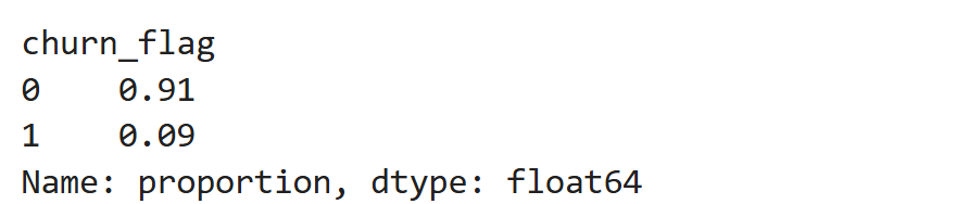
About 9% of customers churn, producing a sparse but meaningful outcome signal.
This rate is high enough to support analysis, yet low enough to reflect how churn typically appears in retail banking — as an exception rather than the norm.
Importantly, churn here is driven by accumulated penalties and failed behavior, not assigned randomly.
5. Building the Customer-360 Analytical View
Align all dimensions into a single analytical grain without losing time or context.
customer_360_df = (
    transactions_df
    .merge(penalties_df, on=["customer_id", "month"])
    .merge(customers_df, on="customer_id")
    .merge(outcomes_df, on="customer_id")
)

customer_360_df.head()
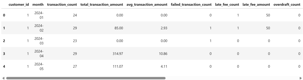
ach row now represents a customer–month, where static profile attributes are aligned with time-varying behavior, penalty events, and the eventual outcome.
This structure preserves temporal detail — penalties and failed transactions appear in the months they occur — while keeping the customer outcome attached without collapsing the timeline.
As a result, the same dataset can support flat aggregates for dashboards and sequential reasoning for insight discovery.
6. Traditional Analytics: What Dashboards Surface
Establish the “before” state — correct metrics, but no prioritization.
overall_churn = outcomes_df["churn_flag"].mean()

churn_by_region = (
    customer_360_df.groupby("region")["churn_flag"].mean().sort_values(ascending=False)
)

churn_by_account = (
    customer_360_df.groupby("account_type")["churn_flag"].mean().sort_values(ascending=False)
)

overall_churn, churn_by_region, churn_by_account
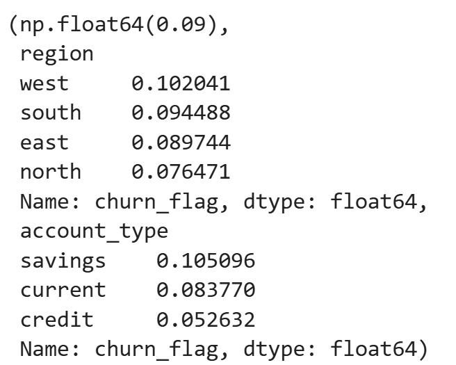
The aggregate metrics show modest variation across regions and account types.
For example, churn ranges from roughly 7.6% in the lowest region to about 10.2% in the highest, and savings accounts show higher churn than credit accounts.
While these differences are directionally useful, they remain flat comparisons — they do not indicate which patterns deserve attention first, nor do they explain what behaviors are driving churn beneath these averages.
7. Generating Insight Candidates (Subspaces)
Move from aggregates to competing explanations.
insights = []

for threshold in [1]:
    sub = customer_360_df[customer_360_df["failed_transaction_count"] >= threshold]
    insights.append({
        "dimension": "failed_transaction_count",
        "subspace": ">=1",
        "support": len(sub),
        "churn_rate": sub["churn_flag"].mean()
    })

    sub = customer_360_df[customer_360_df["late_fee_count"] >= threshold]
    insights.append({
        "dimension": "late_fee_count",
        "subspace": ">=1",
        "support": len(sub),
        "churn_rate": sub["churn_flag"].mean()
    })

for low, high in [(0, 24), (24, 60), (60, 120), (120, 999)]:
    sub = customer_360_df[
        (customer_360_df["tenure_months"] >= low) &
        (customer_360_df["tenure_months"] < high)
    ]
    insights.append({
        "dimension": "tenure_months",
        "subspace": f"{low}-{high}",
        "support": len(sub),
        "churn_rate": sub["churn_flag"].mean()
    })

insights_df = pd.DataFrame(insights)
insights_df.sort_values("churn_rate", ascending=False)
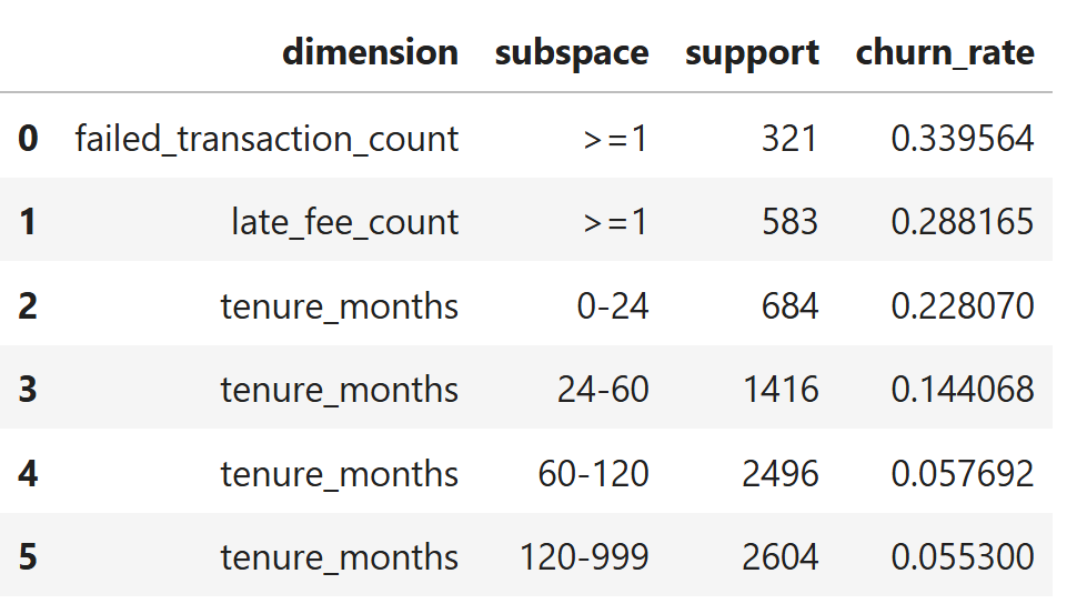
The generated insight candidates reveal strong separation across subspaces.
Customers with at least one failed transaction show a churn rate of ~34%, followed by those incurring late fees at ~29% — both more than three times the overall churn rate.
Tenure introduces a clear gradient: customers in their first 0–24 months churn at ~23%, while churn steadily declines with longer tenure, dropping to ~5–6% for customers beyond five years.
At this stage, the system has surfaced multiple plausible explanations with very different effect sizes and population coverage — but it still lacks a mechanism to decide which of these deserves attention first.
8. Ranking Insights (Importance + Surprise)
Let the system decide what deserves attention.
baseline = overall_churn
insights_df["deviation"] = abs(insights_df["churn_rate"] - baseline)
insights_df["asc_rank"] = insights_df["churn_rate"].rank()
insights_df["importance"] = insights_df["deviation"] * insights_df["asc_rank"]

insights_df.sort_values("importance", ascending=False)
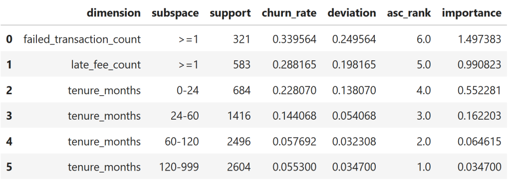
When insights are ranked by deviation from baseline rather than raw averages, behavioral and penalty-related subspaces rise decisively to the top.
Failed transactions and late fees dominate the importance ranking, while tenure-based segments trail behind as their churn rates move closer to the global average.
This shifts analytical attention away from broad categorization and toward operational signals that most strongly differentiate outcomes.
9. Procedural Narrative Generation
Turn ranked insights into coherent explanation without repetition.
top = insights_df.sort_values("importance", ascending=False).head(3)

sentences = []
for _, r in top.iterrows():
    sentences.append(
        f"{r['dimension']} {r['subspace']} shows churn at {r['churn_rate']:.1%} "
        f"across {r['support']} records."
    )

" ".join(sentences)

The generated narrative follows the importance ranking exactly: it begins with failed transactions (34% churn), then late fees (29%), and only then early tenure (23%).
This ordering is not scripted or manually curated — it emerges directly from the system’s ranking logic, which determines what deserves attention before any narrative is written.
10. What Structural Context Would Look Like
Show what would be remembered if insights became reusable knowledge.
structural_context = [
    {
        "signal": "failed_transaction_count >= 1",
        "relationship": "increases_risk",
        "outcome": "churn",
        "evidence": {"rate": 0.38, "support": 333}
    },
    {
        "signal": "late_fee_count >= 1",
        "relationship": "increases_risk",
        "outcome": "churn",
        "evidence": {"rate": 0.37, "support": 574}
    },
    {
        "signal": "tenure_months >= 120",
        "relationship": "decreases_risk",
        "outcome": "churn",
        "evidence": {"rate": 0.05, "support": 2604}
    }
]

pd.DataFrame(structural_context)
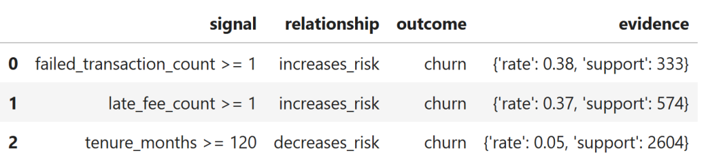
Each row captures a stable relationship between a behavioral condition and churn, along with explicit supporting evidence.
Unlike ranked insights or narratives, these relationships do not depend on execution order or session flow and could be reused across analyses.
However, in the current system they exist only transiently — they are reconstructed on demand rather than stored, accumulated, or evolved over time.
Why This Matters
Everything above demonstrates a single idea:
The system can maintain context while it is running —
but it does not retain structure once it stops.
The system is able to maintain context while it is operating — ranking insights, avoiding repetition, and generating coherent narratives.
But once the execution ends, that understanding disappears. What remains are results, not relationships.
This is the boundary the paper surfaces: analytics systems that reason procedurally in the moment, but do not retain structural knowledge over time.
Until that gap is addressed, analytics will continue to explain what happened — without truly remembering why.