The Dashboard That Starts the Investigation
At the beginning of a quarterly strategy review, the retail banking analytics dashboard shows something unexpected. Customer lifetime value projections for multi-account households are suddenly 6% lower than the previous quarter. Cross-product relationship growth appears weaker, and retention predictions for affluent families show signs of decline. Operational teams confirm that no major policy changes were announced, marketing campaigns remain stable, and deposit growth across the bank looks healthy. Yet the predictive model driving relationship expansion forecasts is underperforming.
The immediate question for analytics teams is not whether the metric is correct, but why it changed. Is the decline reflecting a genuine shift in customer behavior, or is it the result of a data quality issue somewhere in the pipeline?
The investigation typically begins in a familiar way. BI analysts inspect dashboards and segmentation trends. Data engineers begin reviewing feature pipelines and data ingestion jobs. Data scientists analyze model diagnostics and feature importance patterns. After hours of work—sometimes days—the root cause finally becomes clear. In one case it might be a silent schema change in a household relationship table. In another it could be a gradual shift in the financial behavior of younger customers. Sometimes the issue lies in a missing feature or delayed data ingestion.
Modern machine learning systems are quite good at detecting performance degradation. Monitoring systems can quickly alert teams when accuracy drops or prediction distributions shift. However, most systems cannot determine why degradation occurred. That responsibility still rests with human teams. A recent research paper introduces a concept aimed at addressing this gap: Self-Healing Machine Learning, an approach where models autonomously diagnose and adapt to their own degradation.
The Real Problem Behind Declining Model Performance
Machine learning models rarely fail suddenly. In most cases they degrade gradually because the environment around them evolves faster than the model itself. In the context of banking analytics, that environment includes customer financial behavior, product ecosystems, regulatory frameworks, and complex data infrastructure. Over time, changes in any of these areas can reduce the accuracy of predictive models.
From an analytical perspective, most model degradation events fall into four broad categories: data drift, concept drift, data quality failures, and environmental change. Understanding these categories is essential for diagnosing performance drops and determining the appropriate corrective action.
Data Drift: When Customer Behavior Gradually Shifts
Data drift occurs when the statistical distribution of model inputs changes over time. Even if the relationship between inputs and predictions remains stable, a change in input distribution can reduce model accuracy.
Consider a predictive model estimating the probability that a household will expand its financial relationship with the bank by adopting additional products. Historically, the training dataset might have contained a product mix distribution such as the following:
| Household Product Mix | Share in Training Data |
|---|---|
| Savings + Mortgage | 45% |
| Savings + Credit Card | 35% |
| Savings Only | 20% |
Over time, the bank introduces new digital wealth services and integrated financial planning tools. Younger households increasingly combine savings accounts with investment portfolios and insurance products. As a result, the production data distribution gradually evolves:
| Household Product Mix | Share in Production Data |
|---|---|
| Savings + Investments | 38% |
| Savings + Credit Card | 28% |
| Savings + Insurance + Investments | 22% |
| Savings Only | 12% |
The model itself has not changed, but the distribution of customer behavior has shifted. In mathematical terms, data drift occurs when the probability distribution of the training data (P_{train}(x)) differs from the distribution observed in production (P_{prod}(x)).
Two statistical techniques are commonly used to detect such changes. The Kolmogorov–Smirnov test (KS-test) measures the maximum difference between two cumulative distributions and is often used for quick monitoring of numerical features. The test statistic can be expressed as:
D = sup_x |F_{train}(x) − F_{prod}(x)|
where (F_{train}(x)) and (F_{prod}(x)) represent the cumulative distributions of training and production data respectively. A larger value of (D) indicates greater divergence.
Another approach is the Wasserstein distance, also known as Earth Mover’s Distance, which measures the amount of “work” required to transform one distribution into another. Formally, it can be defined as:
W(P, Q) = inf_{γ∈Π(P,Q)} E_{(x,y)∼γ}[|x − y|]
where (γ) represents all possible couplings between distributions (P) and (Q). This metric provides a more interpretable measure of how far the distributions have moved.
In banking analytics environments, drift detection systems often monitor distributions of variables such as deposit balances, investment allocations, digital engagement frequency, and product adoption patterns across households.
Concept Drift: When Financial Relationships Change
Concept drift occurs when the underlying relationship between inputs and predictions evolves. In other words, the model’s representation of reality becomes outdated.
Suppose a model predicts household retention risk based on a set of financial signals. During training, the strongest predictors may have been mortgage ownership, long-term deposit balances, and joint checking accounts. These features historically indicated stable relationships with the bank.
However, customer behavior evolves. Many younger affluent households now manage finances through digital wealth management platforms, automated investment services, and integrated financial planning applications. The same households may hold fewer traditional mortgage products while maintaining strong investment relationships with the bank.
The predictive relationship therefore changes. In mathematical terms, the model attempts to learn a function (y = f(x)), but over time the true relationship becomes (y = f_t(x)), where (f_t) varies with time.
Analytics teams often detect concept drift through shifts in feature importance or prediction errors across customer segments. For example, a model might originally rank predictors as follows:
| Feature | Importance (Training) | Importance (Production) |
|---|---|---|
| Mortgage ownership | 0.35 | 0.18 |
| Deposit balance | 0.28 | 0.22 |
| Investment engagement | 0.10 | 0.32 |
Here, the financial signals that indicate long-term relationships have shifted. The model must adapt to the new behavioral patterns.
Concept drift often manifests as a steady decline in predictive accuracy over time. A typical dashboard might show accuracy gradually dropping from 92% to 83% across several months. Unlike data drift, which reflects distribution changes, concept drift indicates that the economic relationships between variables have evolved.
Data Quality Failures: When the Model Isn’t the Problem
Not every performance drop originates from customer behavior. In many cases the issue lies within the data pipeline itself.
Large banking organizations rely on complex data infrastructure that integrates transaction systems, CRM platforms, wealth management systems, and digital engagement feeds. A small disruption in any of these pipelines can distort the inputs used by predictive models.
Consider a model predicting household relationship expansion. One of its most important features might represent the total value of investment assets associated with a household. If the data ingestion process for the wealth management system fails or a schema change prevents asset balances from updating correctly, the feature may suddenly contain missing values.
| Feature | Missing Rate in Training | Missing Rate in Production |
|---|---|---|
| Household Investment Assets | 0% | 34% |
From the model’s perspective, many households now appear to have no investment activity. As a result, predictions degrade even though customer behavior has not changed. In such situations retraining the model would not solve the problem. The correct action is to repair the data pipeline so that the feature values reflect reality again.
This example highlights a key insight: not every accuracy drop requires a new model. Sometimes the underlying issue lies in the data infrastructure supporting the model.
Environmental Change: When the Business Evolves
The final category of model degradation occurs when the broader business environment evolves. Banks frequently introduce new products, services, and financial planning frameworks designed to deepen customer relationships. These innovations often reshape how households interact with the institution.
Imagine a bank launching a multi-generational wealth advisory program that allows parents, children, and trusts to manage financial assets within a unified advisory ecosystem. Predictive models trained before the launch may only recognize simple household structures such as joint checking accounts or shared mortgage relationships.
The introduction of multi-generational financial planning creates entirely new relationship structures. The model begins receiving inputs that fall outside its training domain. Formally, the model was trained on a feature space (x ∈ D_{train}), but production data now includes values where (x ∉ D_{train}).
In such scenarios retraining may partially address the problem, but the model architecture itself may need redesign to capture the new structure of customer relationships. Environmental change therefore represents a deeper challenge: business innovation outpacing analytical infrastructure.
The Diagnostic Gap in Modern Analytics Systems
Most machine learning monitoring systems today are designed primarily for detection. They can identify anomalies such as declining accuracy, shifting prediction distributions, or abnormal feature values. However, they rarely determine the underlying cause.
As a result, organizations rely on manual investigation processes involving multiple teams. BI analysts explore dashboards, data engineers trace pipeline dependencies, and data scientists analyze model diagnostics. This collaborative approach works, but it is slow and expensive.
The concept of self-healing machine learning addresses this gap by embedding automated diagnosis into the analytics infrastructure itself. Instead of simply alerting teams when something goes wrong, the system performs its own investigation and recommends corrective actions.
The Self-Healing Analytics Loop
A self-healing machine learning system operates through four interconnected stages: monitoring, diagnosis, adaptation, and testing.
Monitoring involves continuously evaluating analytical signals such as prediction accuracy, feature distributions, missing value rates, and segment-level model performance. When significant deviations occur, the system automatically initiates diagnostic analysis.
During the diagnosis stage, the system evaluates possible explanations for the degradation. Using statistical tests and analytical signals, it estimates probabilities for different causes. For example, the system might conclude that there is a 52% probability of data drift, a 31% probability of concept drift, and a 17% probability of a data quality issue. This probabilistic reasoning converts what is often a manual investigative process into a structured analytical workflow.
In the adaptation stage, the system proposes candidate interventions. If the diagnosis indicates data drift, retraining the model with updated data may be recommended. If concept drift is detected, feature engineering updates or model redesign may be necessary. When data quality issues are identified, repairing the data pipeline becomes the priority.
Finally, the testing stage evaluates candidate solutions using validation datasets or controlled experiments. The model version that produces the best performance metrics becomes the new production system. In effect, the machine learning system runs its own continuous improvement cycle.
The Economics of Model Retraining
Retraining machine learning models is not always straightforward. Large enterprise models often require significant computational infrastructure, including distributed GPU clusters and extensive validation pipelines. In recommendation or ranking systems, retraining costs can reach tens or hundreds of thousands of dollars per cycle when compute resources, engineering time, and operational validation are considered.
Frequent retraining therefore creates both financial and operational pressure on analytics teams. Every retraining cycle consumes infrastructure resources, requires engineering oversight, and increases the complexity of deployment pipelines. For large banking organizations managing dozens or hundreds of predictive models across risk, marketing, and relationship analytics, these costs accumulate quickly.
As a result, many organizations increasingly look for ways to reduce the cost of adaptation while maintaining model performance.
Distillation: A More Efficient Adaptation Strategy
One approach that has gained significant traction is model distillation. Distillation transfers knowledge from a large, complex model (the teacher) into a smaller and more efficient model (the student). Instead of training the student model directly from raw labels, the student learns to mimic the predictive distribution produced by the teacher model.
This process is typically formulated as minimizing the divergence between the teacher and student predictions. A common formulation uses Kullback–Leibler divergence:
L = KL(P_{teacher} || P_{student})
Where the student model is trained to approximate the probability distribution generated by the teacher.
Distillation provides several practical advantages for adaptive machine learning systems:
| Advantage | Operational Impact |
|---|---|
| Lower computational cost | Smaller models require less infrastructure to train and deploy |
| Faster retraining cycles | Distilled models can be updated more frequently as data evolves |
| Easier deployment | Lightweight models integrate more easily across production systems |
| Scalable adaptation | Organizations can maintain multiple specialized models efficiently |
Within a self-healing machine learning architecture, distillation becomes an important mechanism for rapid adaptation. Instead of retraining very large models from scratch whenever drift is detected, organizations can update a teacher model periodically and deploy distilled student models that adapt more quickly to changing data conditions.
Toward Autonomous Analytics Systems
Self-healing machine learning represents an evolution in how analytics infrastructure operates. Traditional systems function primarily as monitoring tools that alert teams when performance drops. The next generation of systems may behave more like autonomous diagnostic infrastructure capable of detecting anomalies, investigating root causes, proposing corrective actions, and deploying improved models.
For banks managing complex financial ecosystems that span households, wealth portfolios, and multiple generations, such systems could significantly reduce the time required to adapt analytical models to changing customer behavior. As financial services continue to evolve, the analytics platforms supporting them must evolve just as quickly.
Self-healing machine learning offers a glimpse into that future—one where predictive models do more than generate insights about the business. They continuously maintain and improve themselves alongside it.
Below is a clean rewrite designed specifically for your blog with:
- Very short transition from theory → code
- Steps (not cells)
- Exact code preserved from the notebook
- Observation sections explaining the actual outputs you received
- Tables + formulas included where relevant
- Short but informative explanations
- Structure optimized for pasting screenshots
You will only need to paste screenshots where indicated.
Driving the Concept Through Code
To make the idea practical, we can simulate how a production ML system behaves when its environment changes.
Using a bank marketing dataset, we train a model that predicts whether a customer subscribes to a term deposit. We then intentionally introduce four real-world failures:
- Covariate shift
- Label shift
- Concept drift
- Data quality failures
Finally, we build a small Drift Agent that diagnoses these failures automatically.
Step 1 — Import Required Libraries
We begin by importing the libraries required for data processing, modeling, visualization, drift detection, and explainability.
# Data processing
import pandas as pd
import numpy as np

# Machine learning
from sklearn.model_selection import train_test_split
from sklearn.preprocessing import LabelEncoder
from sklearn.metrics import accuracy_score, roc_auc_score, confusion_matrix
from sklearn.linear_model import LogisticRegression
from sklearn.ensemble import RandomForestClassifier

# Drift detection
from scipy.stats import ks_2samp
from scipy.stats import wasserstein_distance

# Visualization
import matplotlib.pyplot as plt
import seaborn as sns

# Explainable AI
from lime.lime_tabular import LimeTabularExplainer
Observation
This experiment combines three categories of tools:
| Category | Purpose |
|---|---|
| Data processing | pandas, numpy |
| Machine learning | scikit-learn |
| Monitoring | KS-test, Wasserstein distance |
These statistical tools help us detect differences between training data distributions and production data distributions.
Step 2 — Load the Banking Dataset
We load the Bank Marketing dataset from the UCI repository.
from ucimlrepo import fetch_ucirepo

# Fetch dataset
bank_marketing = fetch_ucirepo(id=222)

# Features and target
X = bank_marketing.data.features
y = bank_marketing.data.targets

# Combine into single dataframe for convenience
df = pd.concat([X, y], axis=1)

# Display dataset shape
print("Dataset Shape:", df.shape)

# Show column names
print("\nColumns:\n")
print(df.columns.tolist())

# Display first few rows
print("\nSample Data:\n")
display(df.head())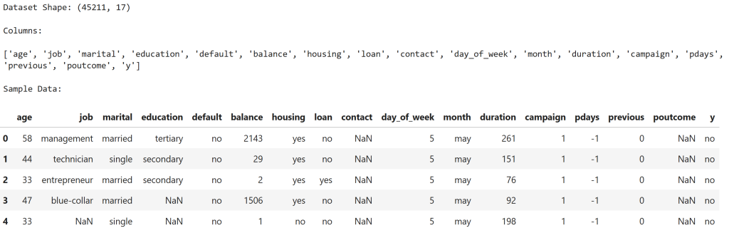
Observation
The dataset contains 45,211 customer records and 17 columns.
Key features include:
| Feature | Description |
|---|---|
| age | Customer age |
| balance | Account balance |
| duration | Marketing call duration |
| campaign | Number of contacts |
| poutcome | Previous campaign outcome |
The target variable is y, where:
| Value | Meaning |
|---|---|
| yes | Customer subscribed |
| no | Customer did not subscribe |
Step 3 — Explore Customer Behavior
We examine the distribution of key variables.
# Check target distribution
print("Target Variable Distribution (Term Deposit Subscription):\n")
print(df['y'].value_counts(normalize=True))
# Plot target distribution
plt.figure()
sns.countplot(x='y', data=df)
plt.title("Distribution of Term Deposit Subscription")
plt.show()
# Age distribution
plt.figure()
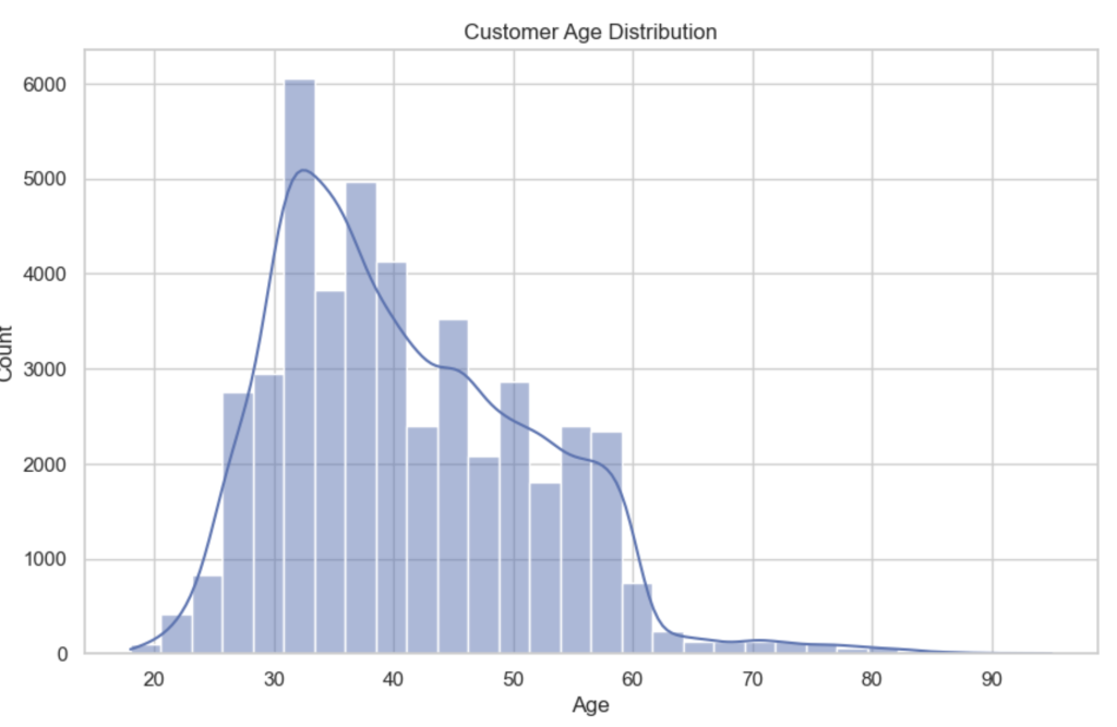
sns.histplot(df['age'], bins=30, kde=True)
plt.title("Customer Age Distribution")
plt.xlabel("Age")
plt.show()
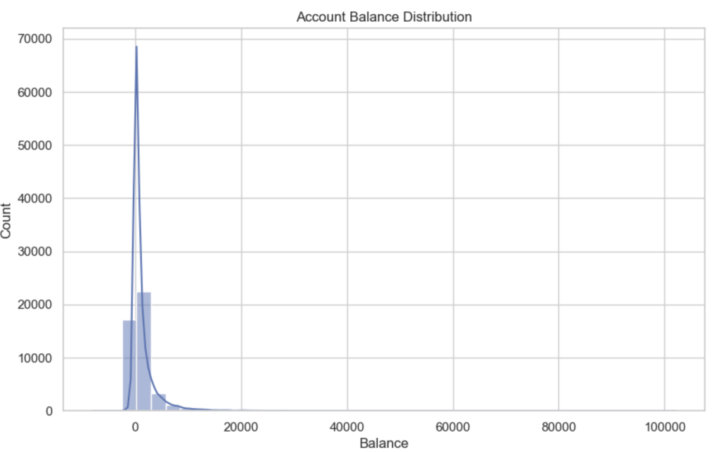
# Balance distribution
plt.figure()
sns.histplot(df['balance'], bins=40, kde=True)
plt.title("Account Balance Distribution")
plt.xlabel("Balance")
plt.show()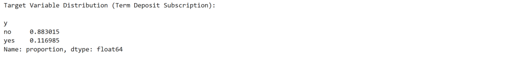
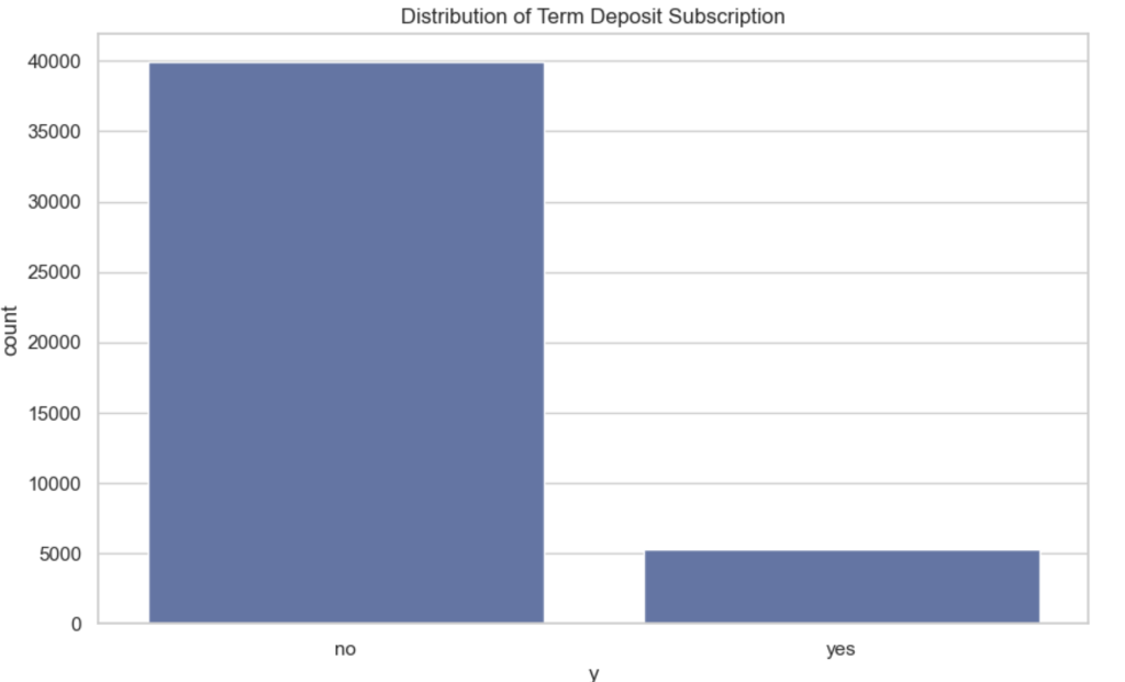
Observation
Target Distribution
| Outcome | Share |
|---|---|
| No subscription | 88.3% |
| Subscription | 11.7% |
This heavy imbalance is typical in marketing campaigns where only a small fraction of customers accept offers.
Age Distribution
The majority of customers fall between 30 and 50 years old, with fewer customers at very young or older ages. This creates a relatively stable demographic distribution.
Balance Distribution
Account balances are highly skewed, with:
- many customers near zero balance
- a long right tail of high balances
This skewness is common in financial datasets and makes balance a sensitive feature for drift detection.
Step 4 — Data Preprocessing
We convert categorical variables into numeric form and prepare the dataset for modeling.
# Make a copy of the dataset to avoid modifying the original
data = df.copy()

# Convert target variable to numeric
# yes -> 1 , no -> 0
data['y'] = data['y'].map({'yes':1, 'no':0})

# Handle missing values
# For categorical columns we fill missing values with "unknown"
for col in data.select_dtypes(include=['object']).columns:
    data[col] = data[col].fillna("unknown")

# For numeric columns fill missing values with median
for col in data.select_dtypes(include=['int64','float64']).columns:
    data[col] = data[col].fillna(data[col].median())

# Encode categorical variables using LabelEncoder
label_encoders = {}

for col in data.select_dtypes(include=['object']).columns:

    le = LabelEncoder()
    data[col] = le.fit_transform(data[col])

    label_encoders[col] = le

# Separate features and target
X = data.drop('y', axis=1)
y = data['y']

print("Preprocessing complete.")
print("Feature matrix shape:", X.shape)
print("Target shape:", y.shape)
Observation
The preprocessing step produces:
| Dataset | Shape |
|---|---|
| Feature matrix | (45,211 × 16) |
| Target variable | 45,211 rows |
Categorical variables such as job, marital status, and education are encoded numerically so that machine learning models can interpret them.
Step 5 — Simulate Training vs Production Data
We split the dataset to mimic a real ML deployment.
# Split dataset into training and test (production simulation)
X_train, X_test, y_train, y_test = train_test_split(
    X,
    y,
    test_size=0.25,
    random_state=42,
    stratify=y
)

print("Training Data Shape:", X_train.shape)
print("Production (Test) Data Shape:", X_test.shape)

print("\nTraining Target Distribution:")
print(y_train.value_counts(normalize=True))

print("\nProduction Target Distribution:")
print(y_test.value_counts(normalize=True))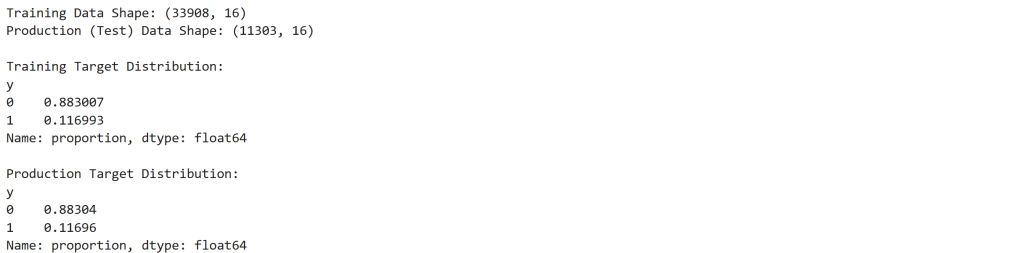
Observation
The split creates two environments:
| Dataset | Rows |
|---|---|
| Training | 33,908 |
| Production simulation | 11,303 |
Importantly, the target distribution remains consistent in both sets:
| Outcome | Share |
|---|---|
| No subscription | ~88% |
| Subscription | ~12% |
This represents a stable baseline system before any drift occurs.
Step 6 — Train Baseline Logistic Regression Model
# Initialize logistic regression model
log_model = LogisticRegression(max_iter=2000)

# Train the model
log_model.fit(X_train, y_train)

# Make predictions on production data
y_pred = log_model.predict(X_test)

# Predict probabilities (for ROC-AUC)
y_prob = log_model.predict_proba(X_test)[:,1]

# Evaluate performance
accuracy = accuracy_score(y_test, y_pred)
roc = roc_auc_score(y_test, y_prob)

print("Logistic Regression Performance")
print("-------------------------------")
print("Accuracy:", round(accuracy,4))
print("ROC-AUC:", round(roc,4))

# Confusion Matrix
cm = confusion_matrix(y_test, y_pred)

plt.figure()
sns.heatmap(cm, annot=True, fmt='d', cmap='Blues')
plt.title("Confusion Matrix - Logistic Regression")
plt.xlabel("Predicted")
plt.ylabel("Actual")
plt.show()
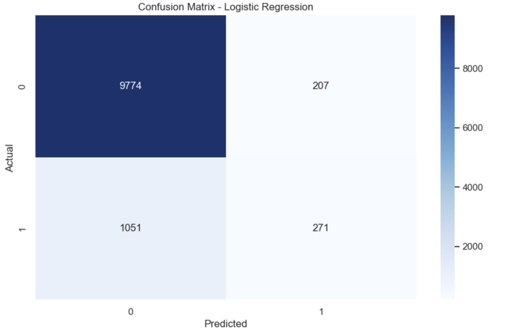
Observation
Baseline performance:
| Metric | Value |
|---|---|
| Accuracy | 0.8887 |
| ROC-AUC | 0.8574 |
The confusion matrix shows that the model correctly predicts most non-subscribers, but struggles to identify actual subscribers due to class imbalance.
Step 7 — Train Random Forest Model
# Initialize Random Forest
rf_model = RandomForestClassifier(
    n_estimators=200,
    max_depth=None,
    random_state=42,
    n_jobs=-1
)

# Train model
rf_model.fit(X_train, y_train)

# Predictions
y_pred_rf = rf_model.predict(X_test)
y_prob_rf = rf_model.predict_proba(X_test)[:,1]

# Evaluate performance
accuracy_rf = accuracy_score(y_test, y_pred_rf)
roc_rf = roc_auc_score(y_test, y_prob_rf)

print("Random Forest Performance")
print("------------------------")
print("Accuracy:", round(accuracy_rf,4))
print("ROC-AUC:", round(roc_rf,4))

# Confusion Matrix
cm_rf = confusion_matrix(y_test, y_pred_rf)

plt.figure()
sns.heatmap(cm_rf, annot=True, fmt='d', cmap='Greens')
plt.title("Confusion Matrix - Random Forest")
plt.xlabel("Predicted")
plt.ylabel("Actual")
plt.show()
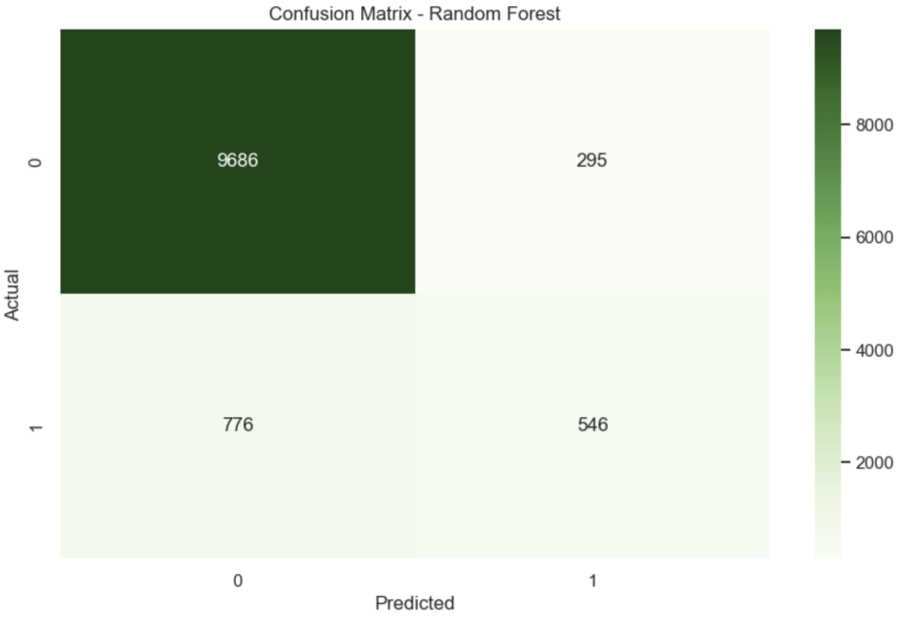
Observation
| Metric | Value |
|---|---|
| Accuracy | 0.9052 |
| ROC-AUC | 0.9255 |
The Random Forest performs significantly better than logistic regression because it captures non-linear relationships between customer features.
This becomes our production model.
Step 8 — Explain Predictions with LIME
# Initialize LIME explainer
explainer = LimeTabularExplainer(
    training_data=X_train.values,
    feature_names=X_train.columns,
    class_names=['No Subscription','Subscription'],
    mode='classification'
)

# Select a customer from production data
customer_index = 10
customer = X_test.iloc[customer_index]

# Generate explanation
exp = explainer.explain_instance(
    customer.values,
    rf_model.predict_proba,
    num_features=10
)

print("Prediction Probability:")
print(rf_model.predict_proba([customer.values]))

# Show explanation
exp.show_in_notebook(show_table=True)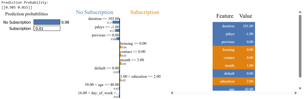
Observation
Prediction probability:
| Outcome | Probability |
|---|---|
| No subscription | 98.5% |
| Subscription | 1.5% |
The explanation shows which features influenced the decision. For example:
| Feature | Influence |
|---|---|
| short call duration | negative |
| no previous campaign success | negative |
| housing loan status | weak positive |
Explainability helps validate that the model behaves logically before monitoring drift.
Step 9 — Simulate Covariate Shift
We now simulate a change in the distribution of customer features in production data.
# Create a copy of production data
X_prod_drift = X_test.copy()

# Simulate demographic shift
# Younger customer population
X_prod_drift['age'] = X_prod_drift['age'] - np.random.randint(5,15,size=len(X_prod_drift))

# Simulate financial shift
# Higher balances due to wealth segment targeting
X_prod_drift['balance'] = X_prod_drift['balance'] + np.random.randint(500,3000,size=len(X_prod_drift))

print("Covariate shift simulated.")

# Plot age distribution comparison
plt.figure()
sns.kdeplot(X_train['age'], label="Training Data")
sns.kdeplot(X_prod_drift['age'], label="Production Drift")
plt.title("Age Distribution Shift")
plt.legend()
plt.show()

# Plot balance distribution comparison
plt.figure()
sns.kdeplot(X_train['balance'], label="Training Data")
sns.kdeplot(X_prod_drift['balance'], label="Production Drift")
plt.title("Balance Distribution Shift")
plt.legend()
plt.show()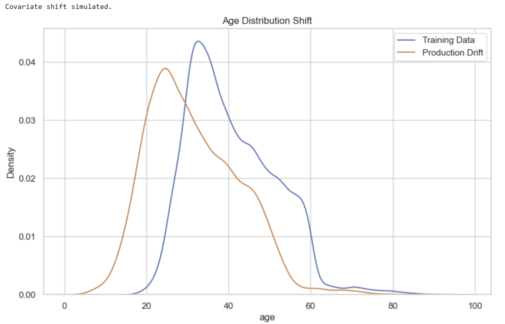
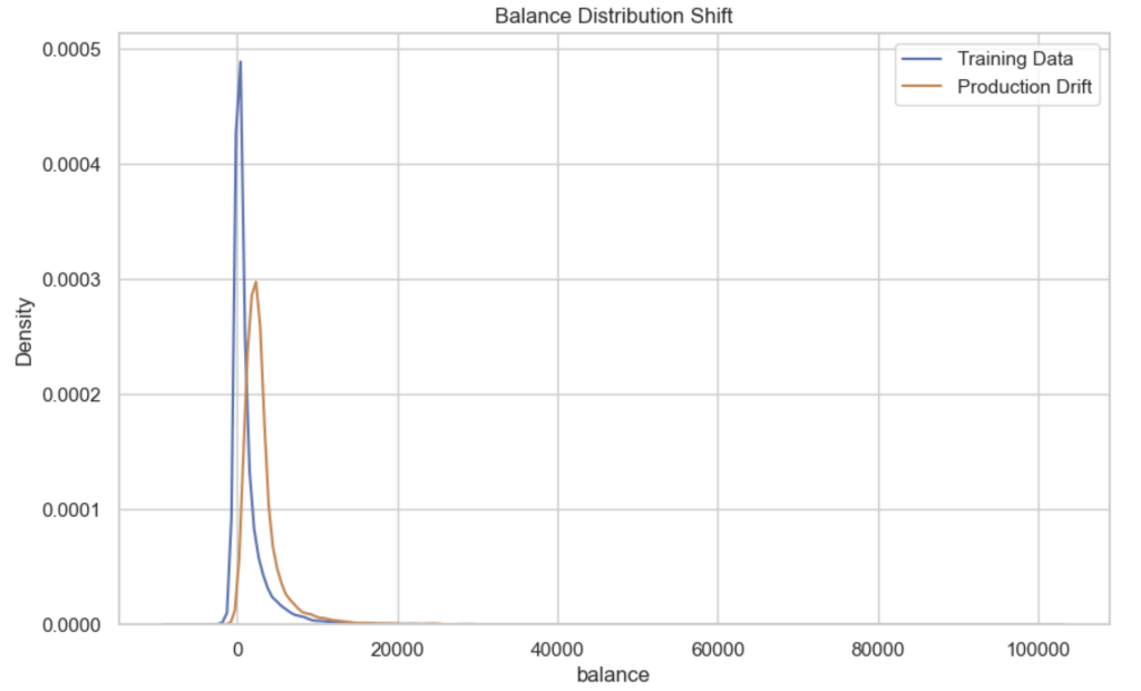
Observation
The charts show clear shifts between training and production distributions.
| Feature | Change |
|---|---|
| Age | Distribution shifts younger |
| Balance | Distribution shifts higher |
Covariate shift occurs when:
[
P_{train}(X) \neq P_{production}(X)
]
The model still sees the same features, but their statistical distributions have changed.
Step 10 — Detect Covariate Drift Using KS-Test
We detect distribution changes using the Kolmogorov–Smirnov test.
# Features we want to monitor for drift
features_to_check = ['age', 'balance', 'campaign', 'duration']

drift_results = []

for feature in features_to_check:

    train_data = X_train[feature]
    prod_data = X_prod_drift[feature]

    ks_stat, p_value = ks_2samp(train_data, prod_data)

    drift_results.append({
        "feature": feature,
        "ks_statistic": ks_stat,
        "p_value": p_value,
        "drift_detected": p_value < 0.05
    })

drift_df = pd.DataFrame(drift_results)

print("KS Test Drift Results:\n")
display(drift_df)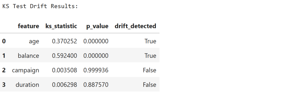
Observation
The results show:
| Feature | KS Statistic | Drift |
|---|---|---|
| age | 0.37 | Detected |
| balance | 0.59 | Detected |
| campaign | ~0.003 | Not detected |
| duration | ~0.006 | Not detected |
The KS statistic measures the maximum difference between two cumulative distributions:
[
D = \sup_x |F_1(x) - F_2(x)|
]
Low p-values confirm that age and balance distributions have significantly shifted.
Step 11 — Measure Drift Magnitude Using Wasserstein Distance
We now measure how far the distributions moved.
wasserstein_results = []

for feature in features_to_check:

    train_data = X_train[feature]
    prod_data = X_prod_drift[feature]

    distance = wasserstein_distance(train_data, prod_data)

    wasserstein_results.append({
        "feature": feature,
        "wasserstein_distance": distance
    })

wasserstein_df = pd.DataFrame(wasserstein_results)

print("Wasserstein Drift Magnitude:\n")
display(wasserstein_df)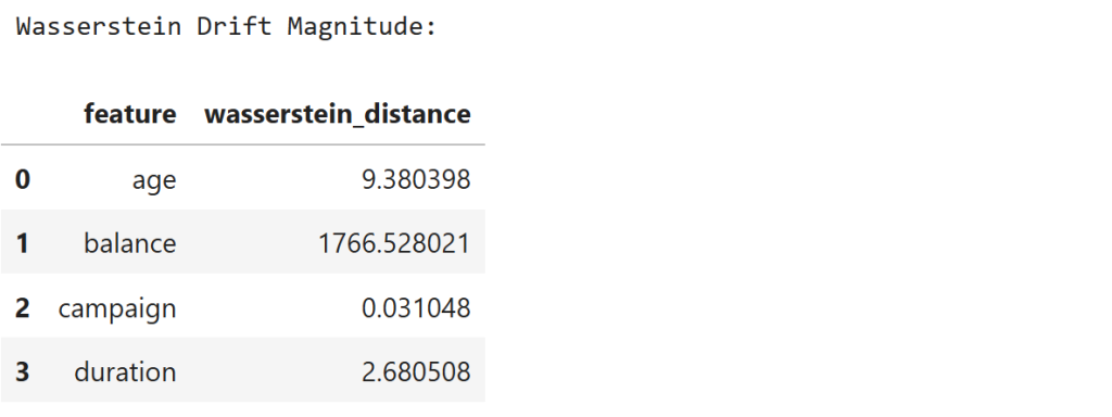
Observation
The results show:
| Feature | Distance |
|---|---|
| age | 9.38 |
| balance | 1766.53 |
| campaign | 0.03 |
| duration | 2.68 |
The Wasserstein distance measures the cost of transforming one distribution into another.
The very large distance for balance confirms that this feature experienced significant financial distribution drift.
Step 12 — Simulate Label Shift
We now simulate a change in customer response behavior.
# Create copy of production labels
y_prod_shift = y_test.copy()

# Simulate drop in subscription rate
# Convert some "yes" labels into "no"

yes_indices = y_prod_shift[y_prod_shift == 1].sample(frac=0.5, random_state=42).index

y_prod_shift.loc[yes_indices] = 0

print("Label shift simulated.\n")

print("Training Label Distribution:")
print(y_train.value_counts(normalize=True))

print("\nProduction Label Distribution (after shift):")
print(y_prod_shift.value_counts(normalize=True))

# Plot comparison
plt.figure()

train_dist = y_train.value_counts(normalize=True)
prod_dist = y_prod_shift.value_counts(normalize=True)

dist_df = pd.DataFrame({
    "Training": train_dist,
    "Production": prod_dist
})

dist_df.plot(kind='bar')
plt.title("Label Distribution Shift")
plt.ylabel("Proportion")
plt.show()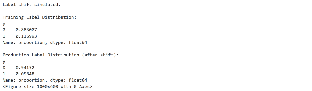
Observation
The subscription rate changes dramatically.
| Dataset | Subscription Rate |
|---|---|
| Training | 11.7% |
| Production | 5.8% |
Label shift occurs when:
[
P_{train}(y) \neq P_{production}(y)
]
This simulates a scenario where marketing campaigns suddenly become less effective.
Step 13 — Detect Label Shift Using Chi-Square Test
from scipy.stats import chisquare

# Calculate counts
train_counts = y_train.value_counts().sort_index()
prod_counts = y_prod_shift.value_counts().sort_index()

print("Training label counts:")
print(train_counts)

print("\nProduction label counts:")
print(prod_counts)

# Expected counts scaled to production size
expected_counts = train_counts / train_counts.sum() * prod_counts.sum()

# Chi-square test
chi_stat, p_value = chisquare(f_obs=prod_counts, f_exp=expected_counts)

print("\nChi-Square Test Results")
print("-----------------------")
print("Chi-square statistic:", chi_stat)
print("p-value:", p_value)

if p_value < 0.05:
    print("\nLabel shift detected!")
else:
    print("\nNo significant label shift detected.")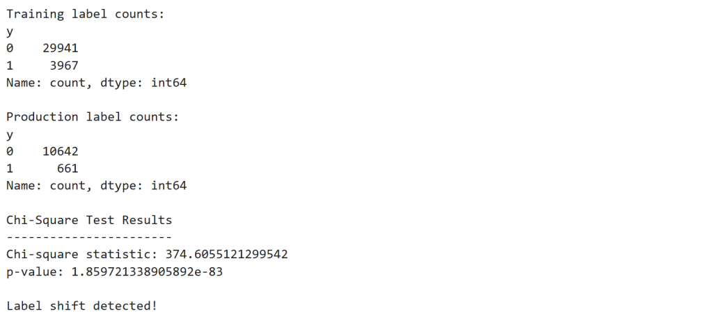
Observation
The test produces:
| Statistic | Value |
|---|---|
| Chi-square | 374.6 |
| p-value | 1.86 × 10⁻⁸³ |
Since:
[
p < 0.05
]
we conclude that the label distribution has significantly changed.
Step 14 — Simulate Concept Drift
Next we simulate behavioral change in customer responses.
# Copy production features
X_prod_concept = X_test.copy()

# Create new target influenced differently by duration
y_prod_concept = y_test.copy()

# Invert relationship between duration and subscription
threshold = X_prod_concept['duration'].median()

y_prod_concept = (X_prod_concept['duration'] < threshold).astype(int)

print("Concept drift simulated.")

print("\nNew production label distribution:")
print(y_prod_concept.value_counts(normalize=True))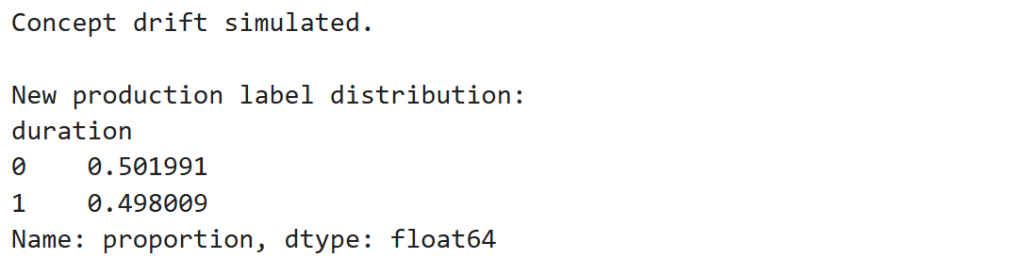
Observation
The new label distribution becomes nearly 50/50:
| Outcome | Share |
|---|---|
| 0 | ~50.2% |
| 1 | ~49.8% |
Concept drift occurs when:
[
P_{train}(y|X) \neq P_{production}(y|X)
]
The relationship between call duration and subscription probability has reversed.
Step 15 — Evaluate Model After Concept Drift
# Predictions from the existing trained model
y_pred_drift = rf_model.predict(X_prod_concept)
y_prob_drift = rf_model.predict_proba(X_prod_concept)[:,1]

# Evaluate model performance
accuracy_drift = accuracy_score(y_prod_concept, y_pred_drift)
roc_drift = roc_auc_score(y_prod_concept, y_prob_drift)

print("Model Performance After Concept Drift")
print("-------------------------------------")
print("Accuracy:", round(accuracy_drift,4))
print("ROC-AUC:", round(roc_drift,4))

# Confusion matrix
cm_drift = confusion_matrix(y_prod_concept, y_pred_drift)

plt.figure()
sns.heatmap(cm_drift, annot=True, fmt='d', cmap='Reds')
plt.title("Confusion Matrix After Concept Drift")
plt.xlabel("Predicted")
plt.ylabel("Actual")
plt.show()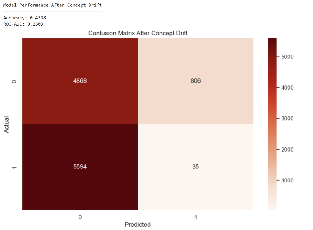
Observation
Model performance collapses:
| Metric | Before Drift | After Drift |
|---|---|---|
| Accuracy | 0.905 | 0.434 |
| ROC-AUC | 0.925 | 0.230 |
The model has effectively learned the wrong behavior pattern.
Step 16 — Simulate Data Quality Failure
# Copy production dataset
X_prod_quality = X_test.copy()

# Introduce missing values in key features
missing_fraction = 0.30

for col in ['balance', 'duration']:

    missing_indices = X_prod_quality.sample(frac=missing_fraction, random_state=42).index
    X_prod_quality.loc[missing_indices, col] = np.nan

print("Data quality issues simulated.")

# Visualize missing values
plt.figure(figsize=(10,6))
sns.heatmap(X_prod_quality.isnull(), cbar=False)
plt.title("Missing Data Heatmap")
plt.show()

# Check missing value percentage
missing_stats = X_prod_quality.isnull().mean()

print("\nMissing Value Percentage:")
display(missing_stats)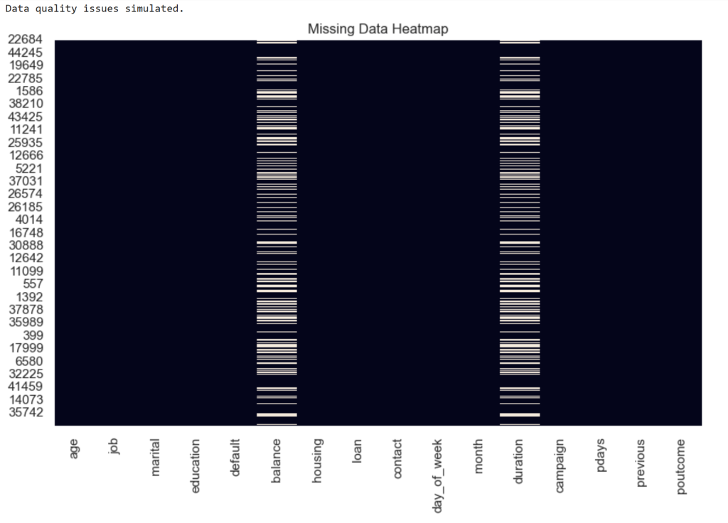
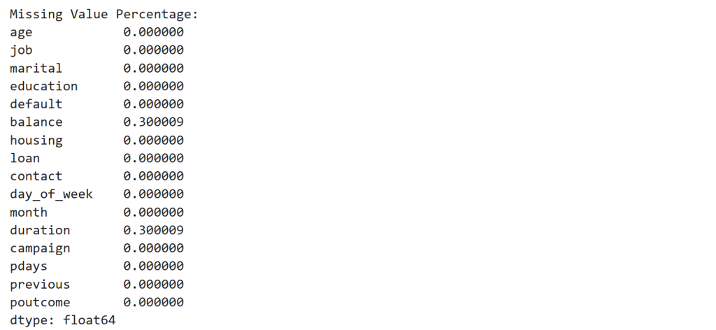
Observation
Two features contain 30% missing values.
| Feature | Missing |
|---|---|
| balance | 30% |
| duration | 30% |
This simulates a data pipeline failure.
Step 17 — Build the Drift Agent
We now implement a small monitoring system that diagnoses the source of degradation.
class DriftAgent:

    def __init__(self):
        pass


    def detect_covariate_shift(self, X_train, X_prod, features):

        drift_features = []

        for feature in features:

            ks_stat, p_value = ks_2samp(X_train[feature], X_prod[feature])

            if p_value < 0.05:
                drift_features.append(feature)

        return drift_features


    def detect_label_shift(self, y_train, y_prod):

        train_counts = y_train.value_counts().sort_index()
        prod_counts = y_prod.value_counts().sort_index()

        expected = train_counts / train_counts.sum() * prod_counts.sum()

        chi_stat, p_value = chisquare(f_obs=prod_counts, f_exp=expected)

        return p_value < 0.05


    def detect_data_quality(self, X_prod):

        missing_fraction = X_prod.isnull().mean()

        problematic_features = missing_fraction[missing_fraction > 0.1]

        return problematic_features


    def detect_concept_drift(self, model, X_prod, y_prod):

        y_pred = model.predict(X_prod)
        accuracy = accuracy_score(y_prod, y_pred)

        return accuracy < 0.7


    def diagnose(self,
                 model,
                 X_train,
                 y_train,
                 X_prod,
                 y_prod):

        report = {}

        report["covariate_shift_features"] = self.detect_covariate_shift(
            X_train,
            X_prod,
            ['age','balance','campaign','duration']
        )

        report["label_shift"] = self.detect_label_shift(y_train, y_prod)

        report["data_quality_issues"] = self.detect_data_quality(X_prod)

        report["concept_drift"] = self.detect_concept_drift(model, X_prod.fillna(0), y_prod)

        return report
Observation
The Drift Agent monitors four signals:
| Detector | Purpose |
|---|---|
| KS-test | Feature drift |
| Wasserstein | Drift magnitude |
| Chi-square | Label shift |
| Accuracy drop | Concept drift |
| Missing values | Data quality |
Step 18 — Run the Drift Diagnosis
agent = DriftAgent()

diagnosis = agent.diagnose(
    rf_model,
    X_train,
    y_train,
    X_prod_concept,
    y_prod_concept
)

print("Drift Diagnosis Report")
print("----------------------")

for k,v in diagnosis.items():
    print(f"{k}: {v}")
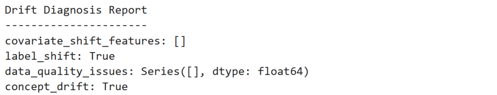
Observation
Final diagnosis:
| Signal | Result |
|---|---|
| Covariate Shift | Not detected |
| Label Shift | Detected |
| Concept Drift | Detected |
| Data Quality | None |
The monitoring system correctly identifies that customer behavior changed, not the feature pipeline.
Final Insight
Self-healing ML systems introduce a feedback loop:
[
\text{Monitor} \rightarrow \text{Diagnose} \rightarrow \text{Adapt}
]
Instead of discovering model failures months later, the system continuously checks whether the world around the model has changed.
And when it has, the system can trigger the appropriate action — retraining, recalibration, or pipeline repair.
Self-healing machine learning reframes model maintenance from reactive debugging to continuous system diagnosis. By monitoring data distributions, model performance, and data quality signals together, systems can identify whether degradation is caused by drift, behavioral change, or pipeline failures. As ML systems become embedded in core business decisions, this shift—from manual troubleshooting to autonomous diagnosis and adaptation—will define the next generation of production AI systems.